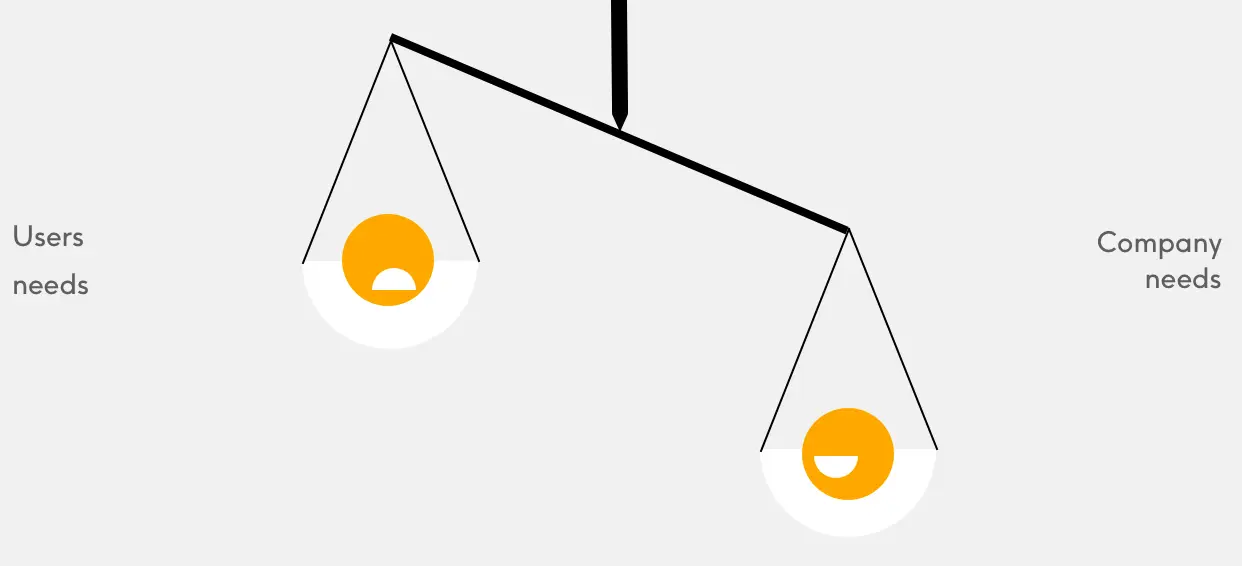
Some say an unwritten rule of user experience is guiding users to navigate through interfaces without even thinking about what they are clicking - seamlessly. This is usually done with the manipulation of graphic elements into carefully designed user flows. But, what is the main goal of doing a such thing - “manipulating user behavior”? Well, it depends on who you ask. If we start with the sunny side, this can help less technical users achieve tasks in their jobs. In general, most companies producing software applications would argue that adjusted user-flows are a positive thing to do. But, is this doing really something that we can take for granted? Why is everybody only talking about improving the performance of interfaces and simplification? Why are there a thousand articles about how to increase the conversion rates, but very few talk about what are the consequences, if there even are any?
First startups
Let’s start drawing some context on the selected topic. As with everything else the revolution of the internet started with very basic websites. At the time only a few people even thought about user experience or conversion rates (ex: the percentage of people that register to an app, the percentage of people that follow a profile, etc.). All internet visionaries wanted was to show added value and eventually make some profits out of it. There were founders like Larry that helped us with searching the World Wide Web, Jeff bringing the shopping experience to the Internet, and Mark connecting faces across the planet. At first user interfaces on these websites were very simple, harmless. You typed a string and got back almost none adjusted results. For example, websites with more traffic in your country and relevant content ordered first. Awesome, right? Yes, we get a lot of knowledge out of exploring the web! A whole new virtual world opened up for my generation, millennials. You order second-hand books and from the comfort of your home. You get to like friends’ pictures from another side of the world.
The average time spent on the internet increased from a few minutes to more than two hours (1)
As time passed these and many other dot com companies not only showed added value but made tons of money while doing so.
Excellently performing digital giants
Until now we got a little less than 2 billion websites (Statista, 2019). Most of the economy is very dependent on the wires and satellites forming the internet. Many websites are now integrating like buttons and modern internet users are pretty much seeing/hearing Ads every they surf or stream. Current web giants are teaching smaller tech companies the latest design patterns. These awesome lessons are nowadays available on a variety of channels and their main goal is common - mimic their best practices. Senior tech thinkers like engineers or designers are actually the best followers of these guide books. One of the main advantages is that these design patterns are giving everyone a pretty democratic option to start their one online business - a startup. In a contrast to that, there are close to zero UI ethics guidebooks on user interface design. At least there are now few attempts towards that, called GDPR. Minor digital product hacks or dark patterns Now to the main question of this article, did we already fell under the tricks of user experience designers? To answer this question let’s write down a few examples of such user flow hacks or if you wish dark patterns.

LinkedIn (Microsoft)
Onboarding asking you to import your contact book and sending impersonated emails saying something like “Marko is inviting you to join LinkedIn”. So I just joined LinkedIn, I am not even sure what this website does and I am already inviting my friends to join me? Sorry, but to me, that doesn’t feel like the user needs it at all.
iPhone (Apple)
It’s 2020 and everybody owns a phone. With a phone, we get preinstalled apps like a Garage band, Email client, Maps, Calendar, etc. and most users get to spend the rest of the time using these apps. Are these stock apps the best option for all kinds of iPhone users? I don’t think so. Prime (Amazon) Do most people need a $119 subscription per year? Maybe you watch Netflix, maybe you also listen to Spotify, and probably shipping is free even if you are not a prime member. So why users still stick to it? It’s a simple, free one month trial.
Youtube (Google)
Related party. The latest and greatest example of this is American elections. To increase the watch time Youtube is offering you related videos depending on previous videos you watched. Awesome. Watch a video about how the elections are “stolen” and you will get many more videos about that. Not so great anymore. We get the picture. Companies trick us with dark patterns into subscribing, watching, following things we don’t actually need. The worst of all, with our screen time we spending in front of these websites/services we prioritize their products over smaller ones.
Consequences are invisible. Once people see a proof about the dark patterns of digital products, they often think about detoxing or come to the conclusion that technology is bad. Well, I say the opposite, people just don’t understand it.
This is just an abstract to a series revealing dark patterns and teaching about steps we can take towards sustainable digital products.

